Post by earl on Apr 25, 2008 16:42:46 GMT
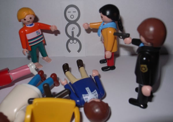
It cost £14,000 to create, but clearly no-one at the smart London design outfit that came up with the new logo for HM Treasury thought to turn it on its side.

The logo, for the Office of Government Commerce, was intended to signify a bold commitment to the body’s aim of “improving value for money by driving up standards and capability in procurement”.
Instead, it has generated howls of mirth and what is likely to be a barrage of teasing emails from mandarins in other departments.
According to insiders, the graphic was already proudly etched on mousemats and pens before it was unveiled for employees, who spotted the clanger within seconds.
Staff have apparently now stripped their office of souvenirs bearing the logo, which could appear on eBay within days.
A spokesman for OGC said: “It is true that it caused a few titters among some staff when viewed on its side, but on consideration we concluded that the effect was generic to the particular combination of the letters OGC - and it is not inappropriate to an organisation that’s looking to have a firm grip on Government spend.”
The OGC was created in the early days of the Blair Government when the premier brought in Peter Gershon from GEC Marconi to improve spending efficiency.
His Gershon Report recommended the creation of the OGC and he became its chief executive for its first four years.
OGC now has a staff of 564 with a head office in Norwich and other branches in London, Leeds and Edinburgh. Brand expert Michael Hamilton said while the logo’s double-entendre was probably not deliberate, it could prove an added bonus for OGC.
“They’re going to get more column inches than they could ever have expected before. If I were them, I would be pretty pleased.”


